

Unlocking Actionable Insights: Transforming Big Data with Data Visualization


In such a data-driven era, we strive to extract more meaningful stories from enormous and diverse datasets. Data visualization comes in handy as it helps turn complex data into more accessible, understandable, and simple forms.
In this article, let's explore the essential roles of data visualization and the visualization tools that can help make sense of big data.
What is data visualization?
Simply put, data visualization is the study of representing data using a visual or artistic approach rather than the traditional reporting method. Data visualizations are so ubiquitous and accessible that we can't help but notice.
For instance, have you ever checked a weather app to decide what to wear on a given day? Without having to read any data about the temperature, barometric pressure, or humidity, you can tell it's going to be a stormy, wet day if you open the app and see a cloud with lightning at the top of the screen.

Data visualization on the weather app
Data visualization plays an essential role in modern businesses, as it:
Transforms company data into dynamic, animated graphs to support business objectives
Converts data into visually interactive dashboards to provide insights for the business
Displays the patterns, trends, and correlations to ascertain where they could improve their operating procedures and expand their business.
Draws a big picture of the data under analysis
Utilizes intuitively massive data to highlight significant findings
Helps make better, quick, and informed decisions with data visualization
Standard techniques of data visualization
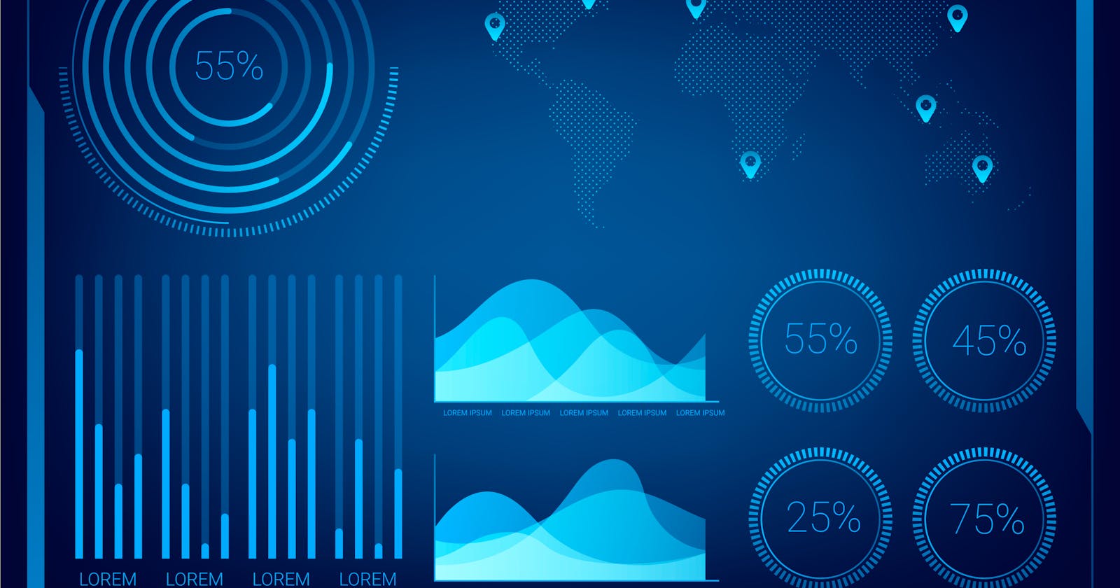
Depending on the kind of data you're working with and the picture you want to depict, you will need to use different data visualization techniques. The standard methods include charts (line, bar, or pie), plots (bubble or scatter), diagrams, maps (heat maps, geographic maps, etc.), and matrices. Each offers specific variations to help you - the storyteller - convince the insightful messages.
Learn more about data story telling at: Practical lessons for data storytelling
Charts
The chart appropriately demonstrates the change in one or several data sets. The relationship between elements is more clearly expressed in some data visualizations, while others could confuse the viewers. When it comes to data, the most appropriate chart type depends on the purposes you're trying to convey. There are four fundamental purposes:
- A relationship tries to demonstrate a connection or correlation between two or more variables using the data provided, like the development of semiconductor export over time versus the overall market trend.
Some of the charts for relationship purposes: scatter graphs and bubble charts.
- A comparison tries to place one set of variables away from another, then show the interaction between the two sets of variables, like the number of visitors to three flagship stores in a single month.
Some of the charts for comparison purposes: bar charts, line charts, column charts, etc.
- A composition tries to gather different data types that make up a whole and showcase them collectively, like the engagement or impression from a website over a month.
Some of the charts for composition: pie charts, waterfall charts, etc.
- A distribution tries to lay out a collection of related or unrelated information simply to see how it correlates, if at all, and to understand if there's any interaction between the variables, like the number of bugs reported during each month of a beta.
Some of the charts for distribution purposes: column histograms, line histograms, etc.

Plots
Plotting and data visualization can tell different stories between features and target variables with actions like comparing quantities, studying trends, quantifying relationships, or displaying proportions.
Imperative components for designing an actionable plot:
Data Component: what type of data it is, e.g., categorical data, discrete data, continuous data, time-series data, etc.
Geometric Component: what kind of visualization is suitable for your data, e.g., scatter plots, line graphs, bar plots, histograms, Q-Q plots, smooth densities, boxplots, pair plots, heatmaps, pie charts, etc.?

Examples of plots
Mapping Component: what variable to use as your independent variable (x-variable) and what to use as your dependent variable (y-variable)? This is important, especially when your dataset is multidimensional with several features.
Scale Component: what kind of scales to use in your plot, e.g., linear scale, log scale, etc?
Labels Component: other things like axes labels, titles, legends, font size, etc.
Maps
Maps depict the physical characteristics of the land, such as its regions, landscapes, cities, roads, and waterways. They allow locating elements on relevant objects and areas — geographical maps, building plans, website layouts, etc.

Examples of maps
Diagrams and matrices
Diagrams are frequently used to show intricate data relationships and links and combine different forms of data into a single visual representation. It is suitable for processing maps, decision support, root cause analysis, idea fusion, and project planning.
Some of the most common types of diagrams are:
- Flowcharts
Mind maps
Venn diagrams
Tree diagrams
SWOT analysis
Fishbone diagrams
Histograms
Wireframes
Site maps
Use case diagrams
Matrix is one of the advanced data visualization techniques that help determine the correlation between multiple constantly updating (steaming) data sets.
Ultimate tools for Data Visualization
A data visualization tool is a form of software developed to visualize data. Although the features of each tool differ, at their most fundamental level, they all let you extract a dataset and visually alter it. Most have pre-built templates that you may use to produce basic visualizations.
1. Tableau
Tableau is one of the market's most popular data visualization tools for two main reasons: it is relatively easy to use and compelling. The software can integrate with hundreds of sources to import data and output dozens of visualization types—from charts to maps.
Tableau boasts millions of users and community members owned by Salesforce, and it's widely used at the enterprise level.
Tableau offers several products, including desktop, server, and web-hosted analytics platform versions and customer relationship management (CRM) software.

Illustration of Tableau
| Pros | Cons |
| Hundreds of data import options |
Mapping capability
Free public version is available
Lots of video tutorials to walk you through how to use Tableau | Non-free versions are expensive ($70/month/user for the Tableau Creator software)
The public version doesn’t allow you to keep data analyses private |
Pros & cons of Tableau
2. Power BI
Power BI is Microsoft's technology-driven business intelligence tool for analyzing and visualizing raw data to present actionable information. It brings out business analytics, data visualization, and best practices to aid an organization's making data-driven decisions.
Thanks to the strengths of the Power BI platform, Microsoft was rated as the leader of the "2019 Gartner Magic Quadrant for Analytics and Business Intelligence Platform" in February 2019.
The following are the factors that make Power BI so popular and necessary in the BI field:
1. Access to volumes of data from multiple sources
2. Interactive UI/UX features
3. Exceptional Excel integration
4. Accelerate Big Data preparation with Azure
5. Turn insights into action
6. Real-time stream analytics

Illustration of Power BI
3. Infogram
Infogram is another popular option that can be used to generate charts, reports, and maps.
What sets Infogram apart from the other tools on this list is that you can use it to create infographics (where its name comes from), making it especially popular among creative professionals. Additionally, the tool includes a drag-and-drop editor, which can be helpful for beginners.
Visualizations can be saved as image files and GIFs to be embedded in reports and documents or in HTML to be used online. Like most of the other tools on this list, Infogram has tiered pricing, ranging from free to enterprise-level.

Illustration of Infogram
| Pros | Cons |
| Tiered pricing, including a free plan with basic |
features
Includes 35+ chart types and 550+ map types
Drag and drop editor
API for importing additional data sources | Significantly fewer built-in data sources than some other apps |
Pros & Cons of Infogram
4. Datawrapper
Datawrapper is a tool to generate charts, maps, and other graphics for online use.
Although Datawrapper is easy to use, it's somewhat limited, especially compared to others on this list. One of the primary limitations is that it doesn't integrate with data sources. Instead, you must manually copy and paste data into the tool, which can be time-consuming and liable to errors if you aren't careful.
Some standard outputs include scatterplots, line charts, stacked bar charts, pie charts, range plots, and various maps and tables. Free and paid options are available, depending on how you intend to use the tool.

Illustration of Datawrapper
| Pros | Cons |
| Specifically designed for newsroom data |
visualization
Free plan is a good fit for smaller sites
Tool includes a built-in color blindness checker | Limited data sources
Paid |
Pros & Cons of Datawrapper
Evaluation for data visualization
Before moving on to building your data dashboard, you should have some idea of what criteria make a data visualization excellent. It should meet the following requirements:
- It's visually appealing. The advent of sophisticated visual creation tools and high-quality mobile apps has raised the bar on the user experience. It will only get higher with the evolution of technology such as Google Glass. Your visualization will go unused if it looks like it was designed with old technology.
- It's scalable. If your data visualization is successful, others will want to use and leverage it. Be sure to build your visualization on a scalable system for accessibility and future maintenance and modifications.
- It gives the user the correct information. It's a problem when users focus on the visual or a particular feature instead of what they need. Before creating a visualization, define exactly how it will be used, such as for self-service, drill-down, deep analysis, or executive overview.
- It's accessible. An accessible visualization is easy to use and can be modified easily when necessary. Also, the data must be accessible on any device at any time or place. This feature is critical for user adoption.
- It allows rapid development and deployment. Gone are the days of waterfall (chart-type) projects and drawn-out data-viz deployments and builds. Users need their information today, and if you can't provide it in a timely fashion, they'll find other ways to get it.
Pitfalls and challenges
The transition from a pure reporting tool like Excel to a more advanced software visualization tool is where new users succumb to common pitfalls. In this blog, we look at pitfalls that relate to how the data is used and designed.
Going Overboard with Data
The temptation to keep adding data to any visualization is almost impossible to resist. Data overload is not only hands down the most common pitfall but also one of the most challenging habits to break.
What can you do to stop yourself from getting into the habit of adding more and more data? Here are two things to consider when you find yourself in this predicament:
Make sure that you spend the necessary time completing the business intelligence (BI) blueprint.
Create a clear message for all four sections of the blueprint.
Falling into the One-Shoe-Fits-All Trap
If you try to build a data visualization for everybody, nobody will use it. We call this situation the "One-Shoe-Fits-All Trap."
To avoid this trap, be sure to follow the storyboard model prescribed. It ensures that you always tell a unique story to your audience, which is the key to long-term user adoption. If you don't craft your story for your specific audience, your users will resent you and your product for wasting their time with information that's irrelevant to them.
Conclusion
With computers, technology, and the corporate business landscape changing so rapidly today (and all indications are that it will continue to change at an even faster pace in the future), what can be considered the future of the art of data visualization?
As per "Data Visualization: The future of data visualization, Towler, 2015: "Data visualization is entering a new era." Emerging sources of intelligence, theoretical developments, and advances in multidimensional imaging are reshaping the potential value that analytics and insights can provide, with visualization playing a key role."
Read more: Practical lessons for data storytelling
With big data getting bigger (and bigger! ), it is safe to undertake the notion that data visualization will only continue to grow, evolve, and be of outstanding value. In addition, how one approaches the process and practice of data visualization will also need to grow and develop.
Don't miss our latest updates and events - Follow us on Facebook and LinkedIn!